BBC Sport app Navigation
This project focused on improving the BBC Sport app’s side navigational menu as the design was outdated and inconsistent with other BBC apps.
I used this project for part of my degree apprenticeship where I could showcase my skills in researching, designing and delivering a proposed solution to a problem. I achieved a ✨Distinction✨ for the delivery, report and presentation of this project.
Timeline
12 weeks, Oct 2025 - Feb 2026
Role
Lead UX Designer
The Project
The problem:
The BBC Sport app uses an outdated side menu that duplicates functionality and does not align with BBC App Design System (ADS), creating inconsistency and potential user confusion.
Research question:
How might we improve the information architecture of the BBC Sport app’s navigation to create a clearer and more consistent experience across BBC products?
Aim:
To evaluate the effectiveness of the current navigation and propose a validated, ADS-aligned alternative.
Scope:
Focused on navigation and IA only — specifically rehoming features from the side menu (account, settings, radio, and nations content).
The Double Diamond Framework
From The Design Council
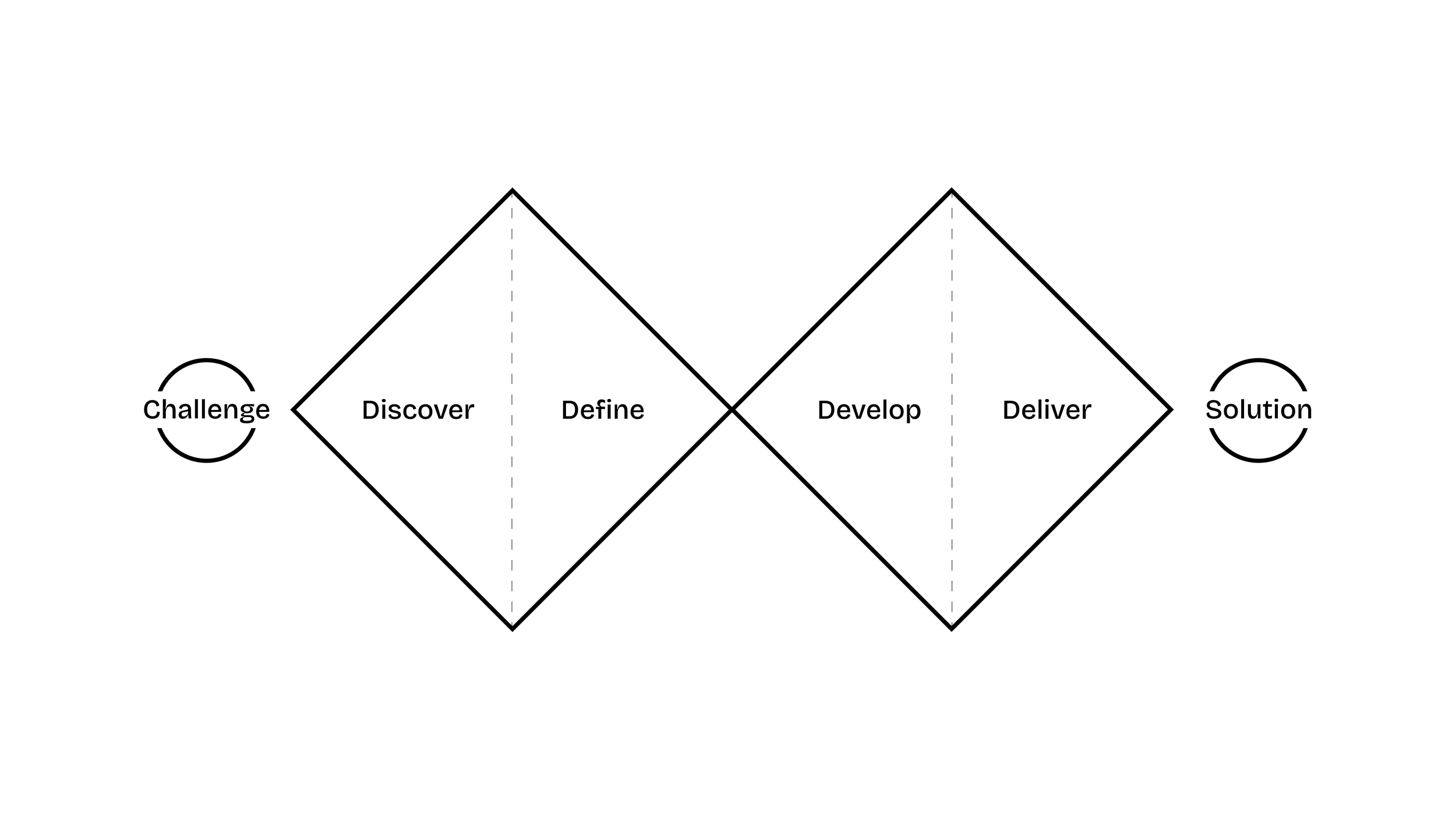
A user-centred design and mixed methods research approach was used, combining qualitative and quantitative research with iterative design and testing. The project was structured into four phases to align with the Double Diamond design process, with a timeline mapped out across the 12 weeks to ensure the project stayed on track.
Methods
Navigation audit and IA mapping
Quantitative usage data analysis
Unmoderated usability testing
Stakeholder workshop
Design reviews
Tools
Miro
FigJam
UserZoom
Piano (internal quant tool)
Figma
Discover
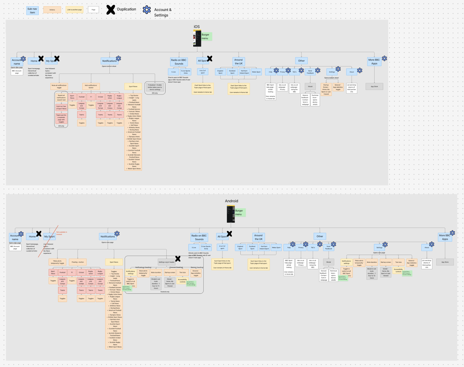
I audited the existing side menu using sitemaps to understand the information architecture and its role within the app’s navigation.
Key findings:
Most menu items duplicated primary navigation found within the bottom tabs (Home, My Sport, All Sport)
Two features were unique to the side menu:
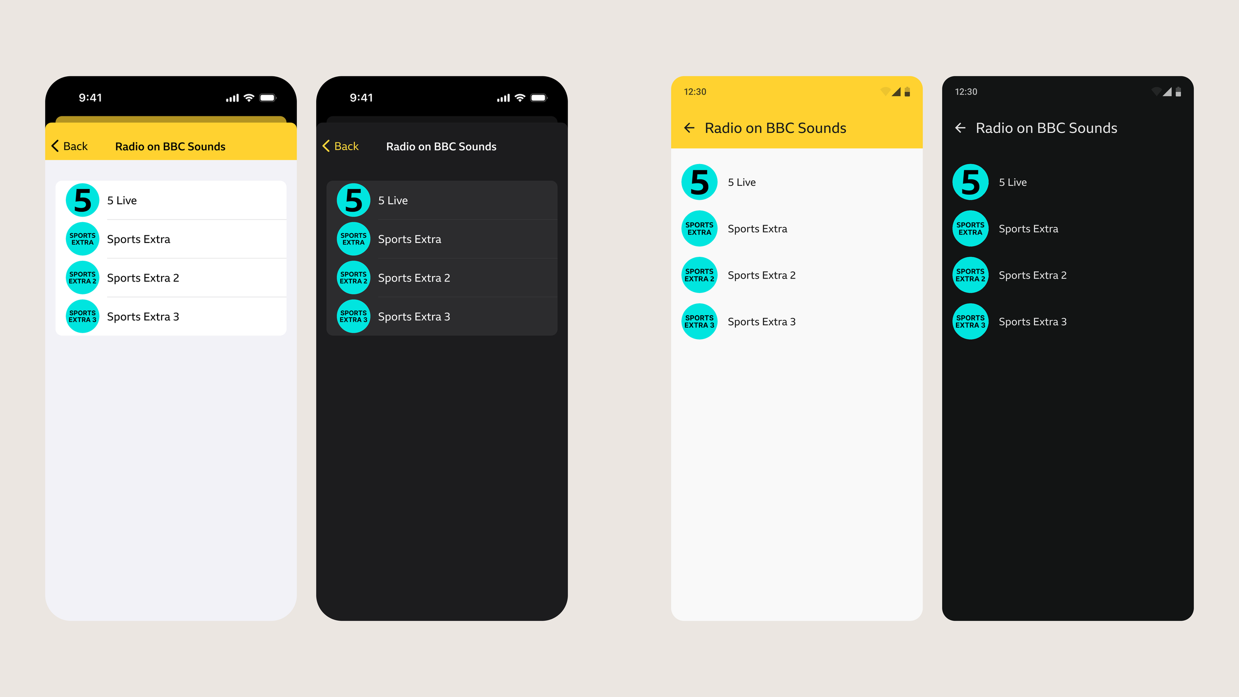
Radio links (BBC Sounds)
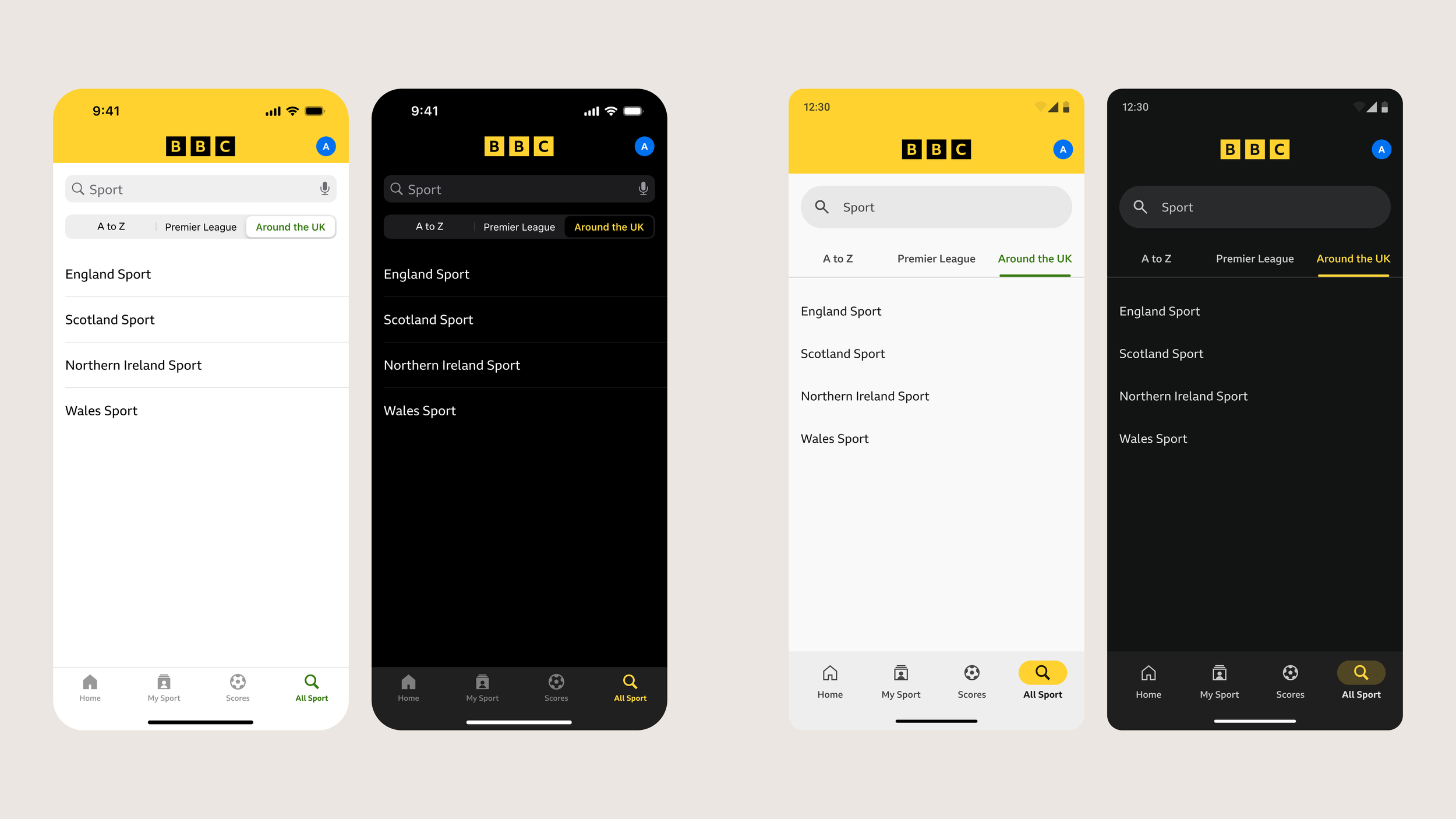
Nations / “Around the UK” content
Despite their placement, usage data showed continued engagement with both features — indicating that they needed to remain discoverable.
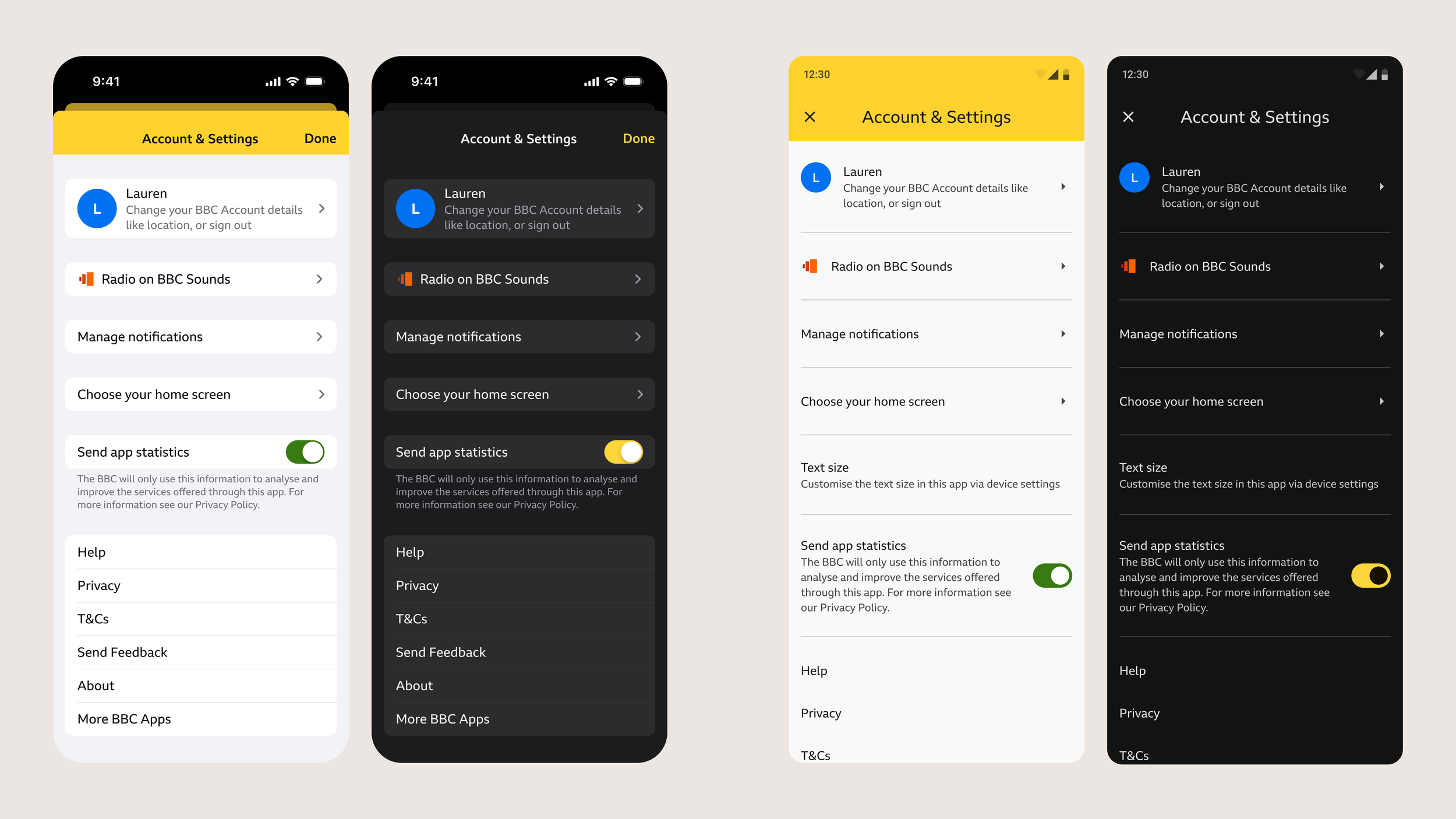
The remaining items were better suited to an Account & Settings model, aligning with patterns used across BBC products.
Define
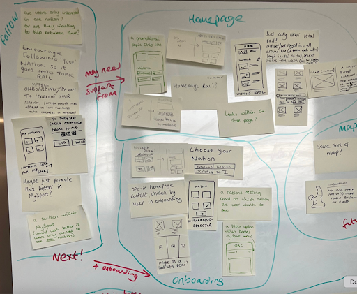
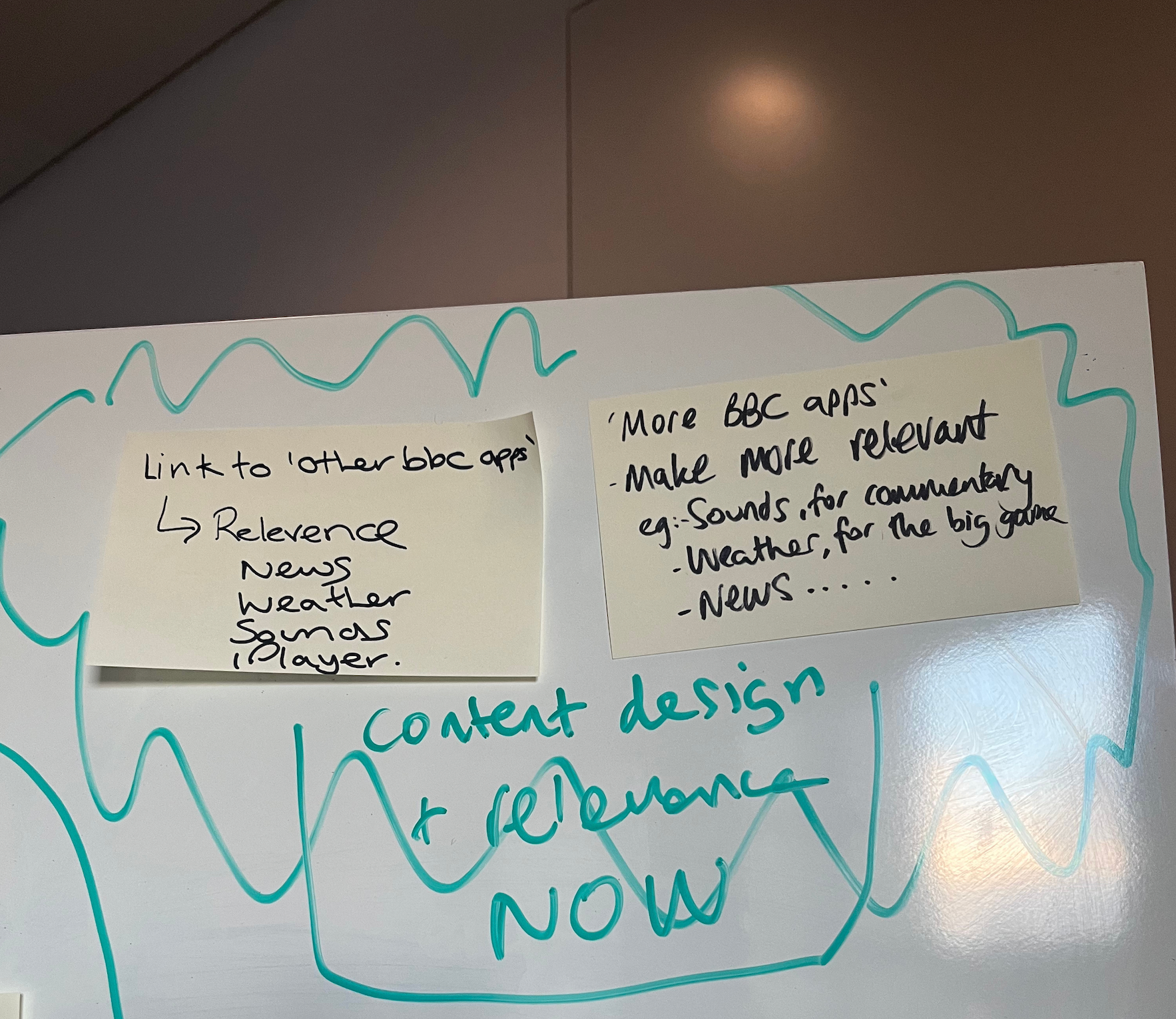
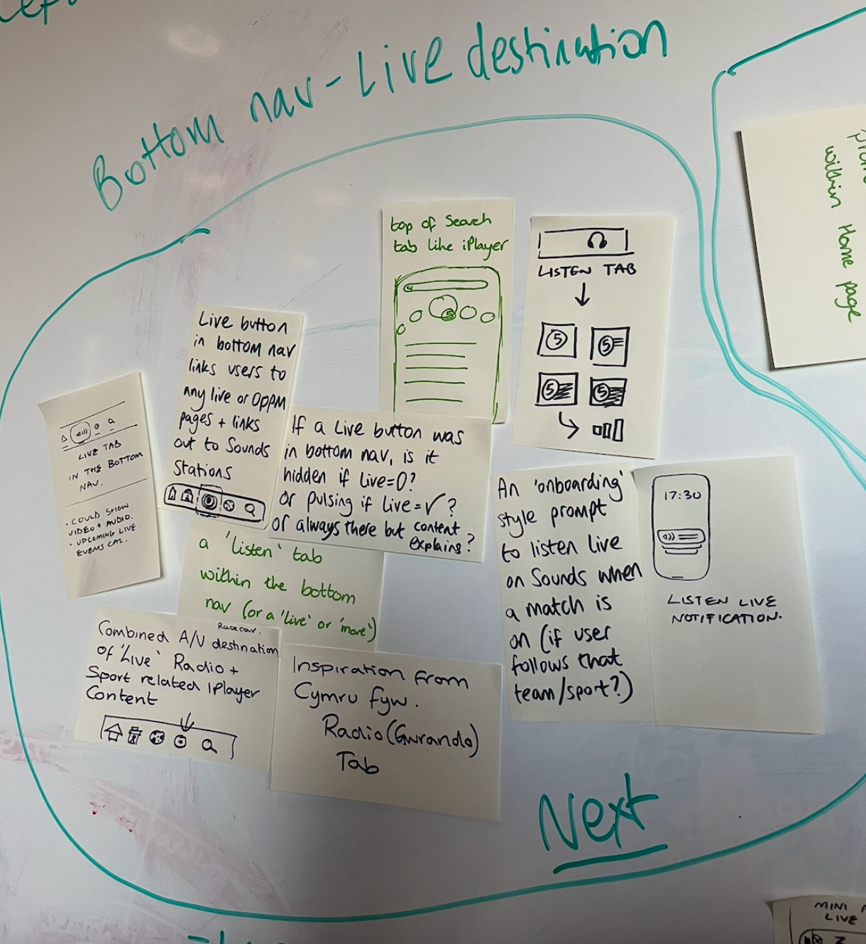
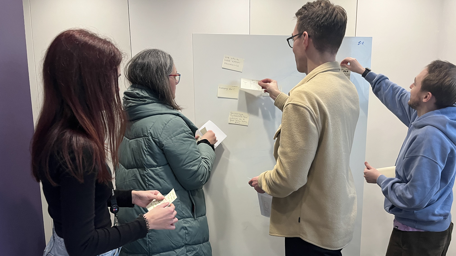
I facilitated a cross-functional workshop with stakeholders across design, product, and engineering to explore navigation restructuring.
Workshop outcomes:
Generated “now vs next” navigation concepts
Explored multiple placements for Radio and Nations content
Aligned on simplifying overall information architecture
To validate assumptions, I conducted unmoderated usability testing with 26 participants across iOS and Android via UserZoom. The key insights found were;
The side menu was used as a last resort, not a primary navigation tool
Users expected Nations content in more intuitive locations (e.g. within content or search)
Radio was strongly associated with the side menu
These findings confirmed that while the menu could be removed, content relocation needed to be carefully handled to maintain discoverability.

Develop
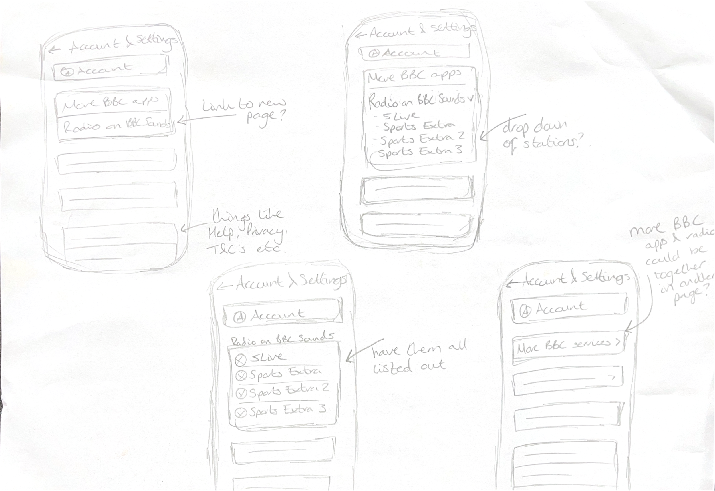
I began with low-fidelity wireframes to rapidly explore navigation structures and user flows. This allowed quick iteration focusing on hierarchy and interaction patterns, before committing to UI.
I then produced high-fidelity designs using BBC App Design System components, ensuring consistency, accessibility, and a native-first approach.
Key design decisions made:
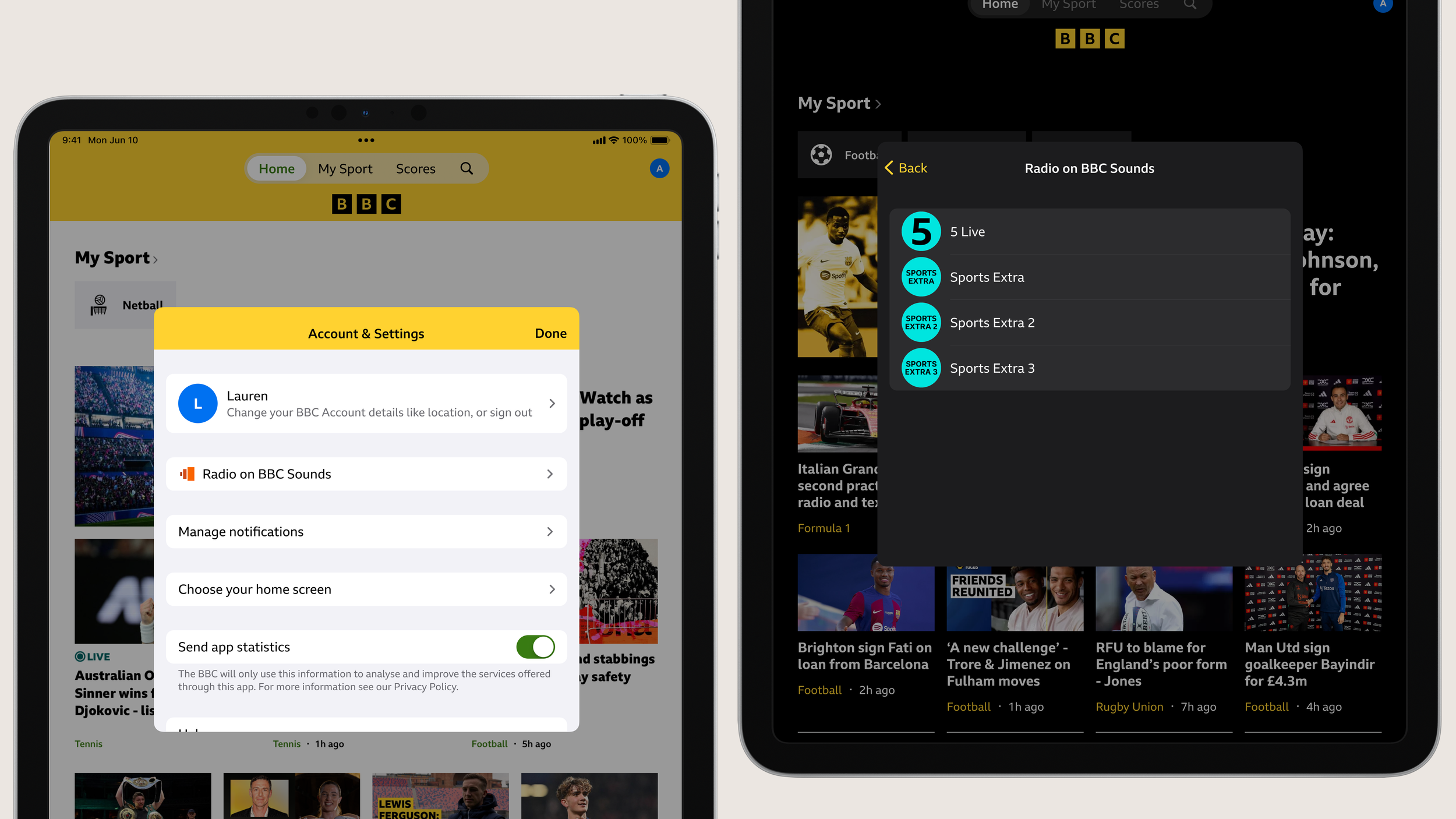
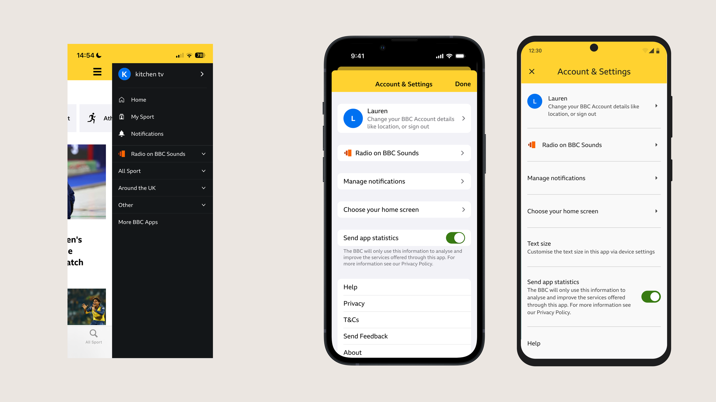
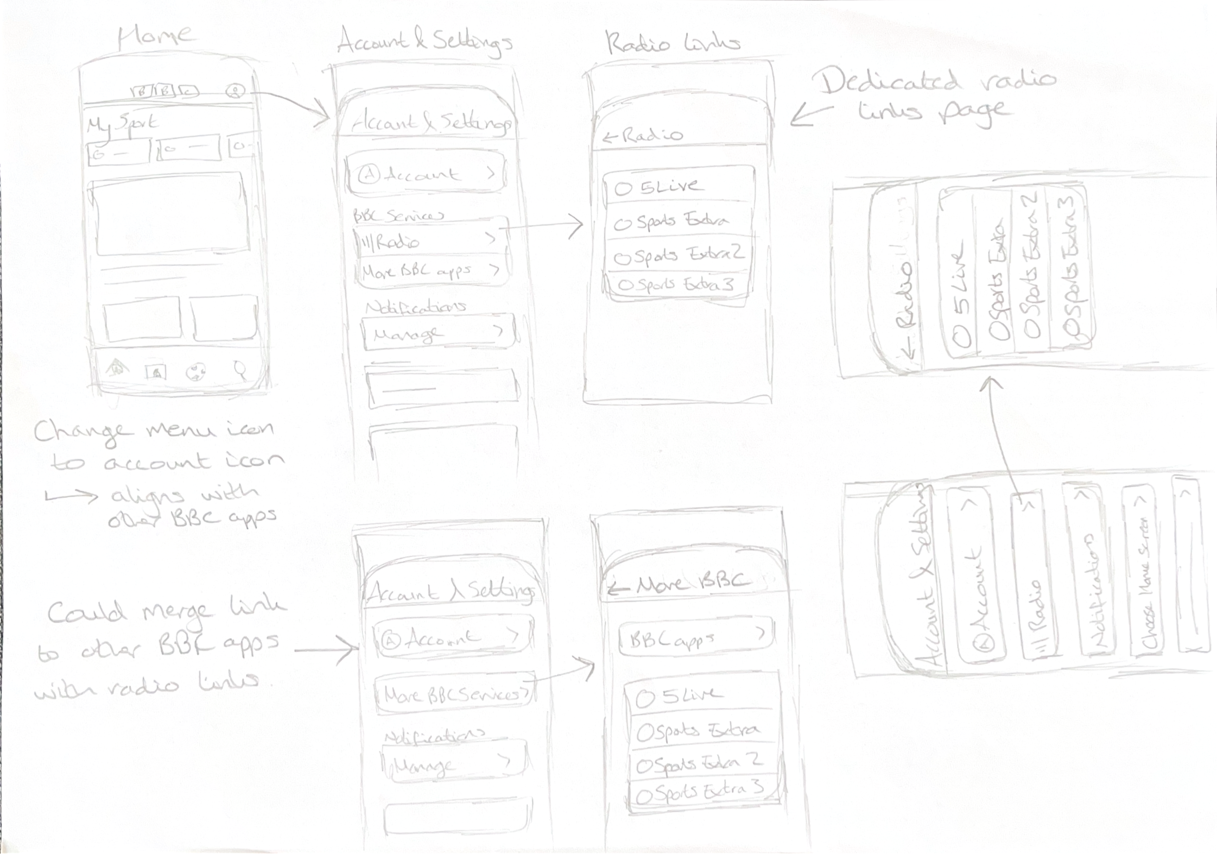
Replaced the side menu with a dedicated Account & Settings area to maintain consistency with other BBC apps
Moved Nations content into the All Sport tab for greater visibility as per the results of the UserZoom
Retained Radio links within Account & Settings as an interim solution
Designs were reviewed regularly with stakeholders to ensure alignment with UX principles and BBC standards.
Deliver
I validated the final designs through further unmoderated usability testing via UserZoom with 82 participants across iOS and Android. Research was analysed through behavioural note-taking and affinity mapping to identify key themes.
Outcomes:
Nations content was easily discovered within the All Sport (search) tab
Minimal negative reaction to removing the side menu
Some difficulty locating Radio within Account & Settings
Due to the hesitancy from users when trying to locate Radio, I provided stakeholders with options on how to proceed. We could create a more phased approach and not change the icon to an account icon to begin with, we could use a tooltip to inform users where to find radio, or we could move radio out of Account and Settings and give it a higher prominence elsewhere in the app.

After discussions with stakeholders, we agreed to utilise a tooltip informing users that the radio location hadn’t changed. Using this feature also helps to promote the radio links to those who didn’t know they were available.
Following this, final designs were created for iOS and Android, light and dark mode, and for mobile and tablet. These were handed off with detailed specifications (colour, spacing, accessibility), supporting a smooth transition to development.