2026 US Midterm Elections
Previous elections coverage had already demonstrated enormous demand — the banner generated millions of onward journeys and helped a significant number of users access deeper election information directly from the News app front page. However, this had previously been delivered through a web-based component embedded directly into the BBC News app, meaning the experience didn't follow the native conventions of iOS or Android.
Timeline
June - August 2026, reading for the elections in November 2026
Role
App UX Designer, collaborating with Web UX Designers
The Project
The opportunity
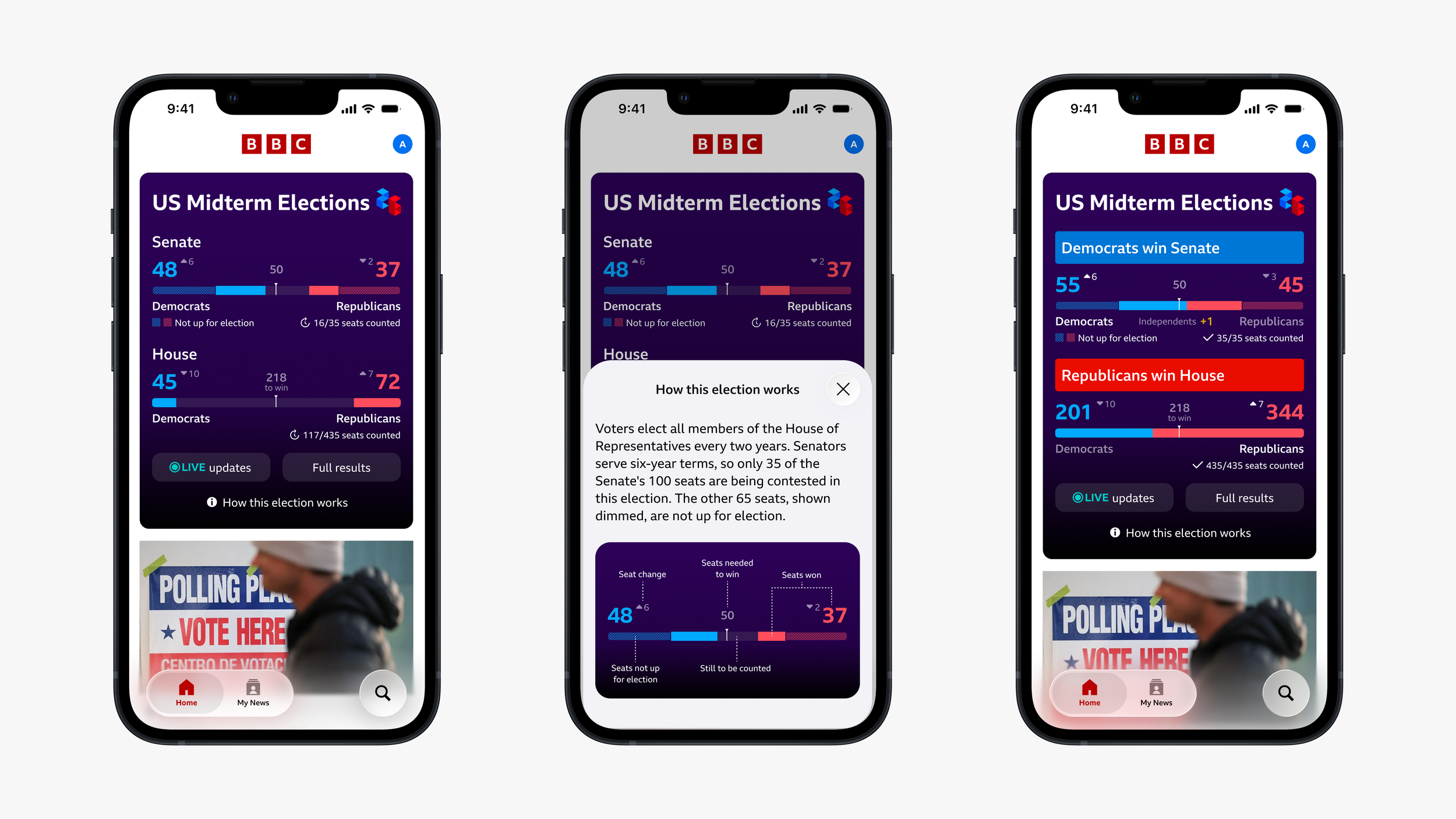
Evolve the elections experience from a web component into a genuinely native app design for both iOS and Android, aligning with BBC's broader strategic shift towards native-first product design across all its apps.
The team
This was a cross-functional project, bringing together two app designers — myself and a colleague — alongside two designers from the BBC Elections web team. This ensured the native app experience and the web experience felt coherent for users.
The Design challenge
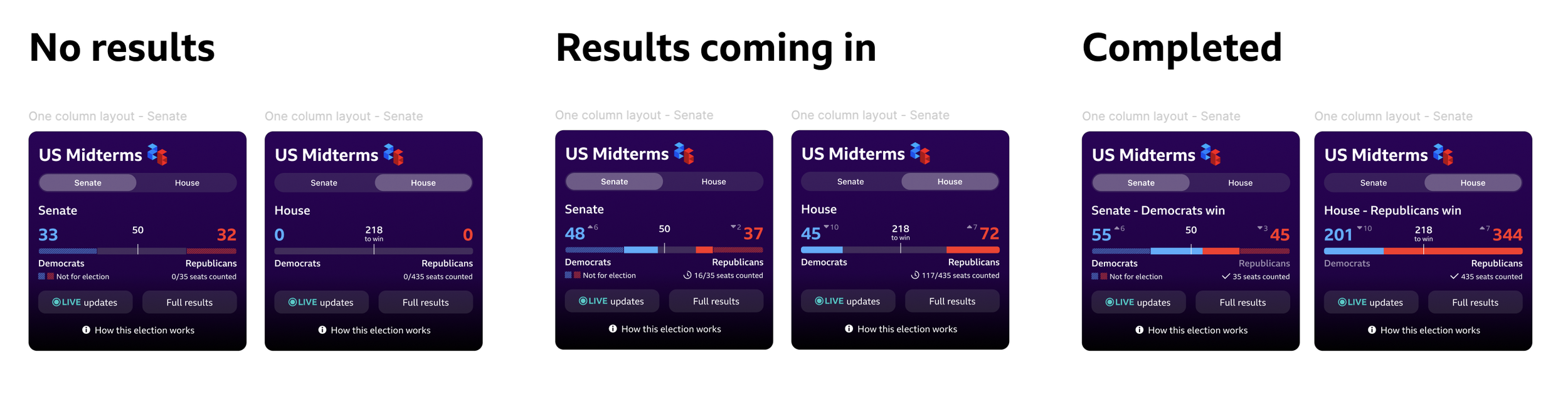
Designing for Three States
The experience needed to work across three distinct states — before any results came in, while results were being counted live, and once all results were completed. Each state presents different information, requiring a carefully considered information hierarchy that could flex without feeling inconsistent or confusing to users.
Two Design Directions
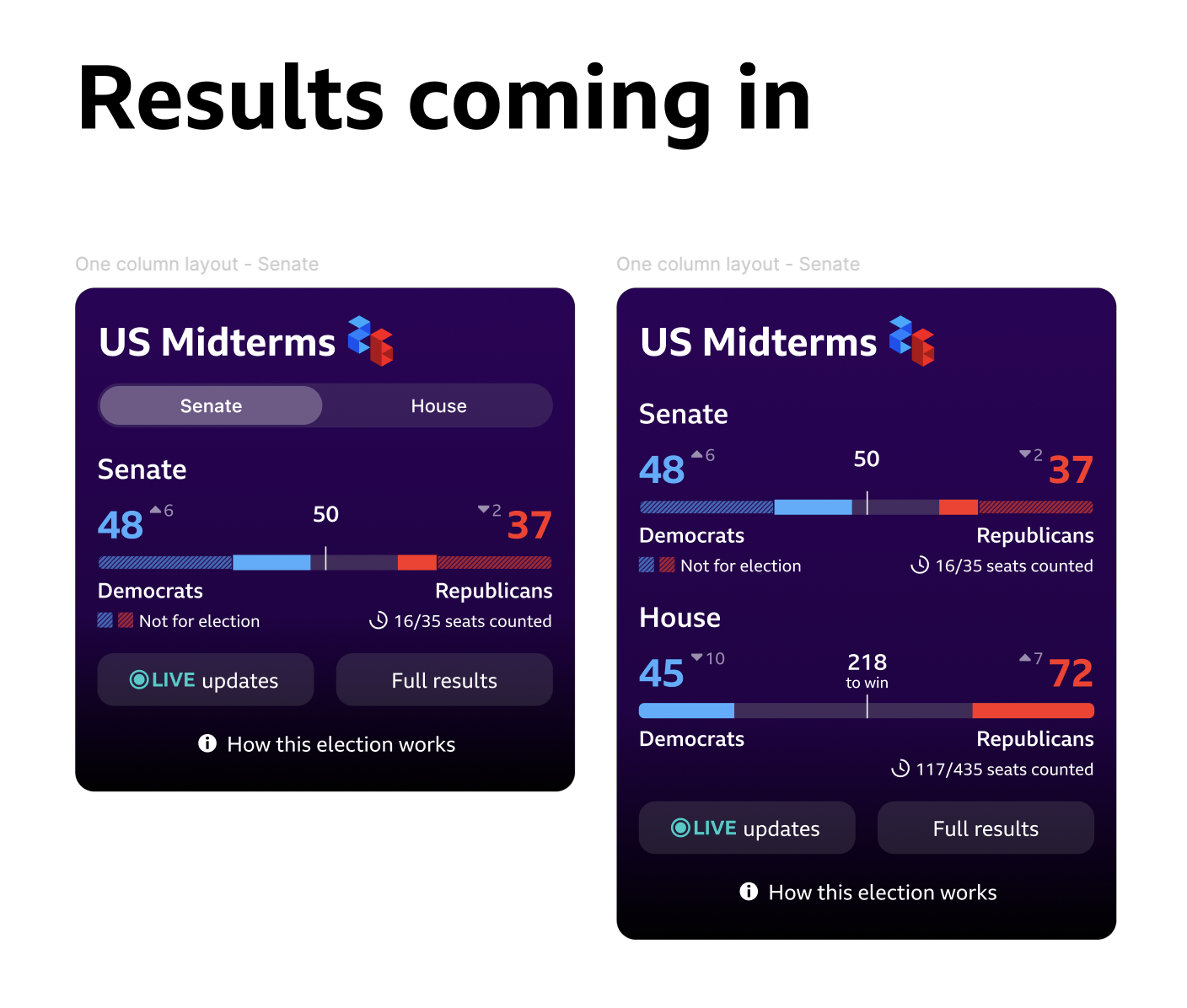
Working alongside my app design colleague, we created two versions of the banner to test with users:
The tabbed version evolved from designs already used for the UK Local Elections in May 2026, separating Senate and House results into two distinct tabs. As designers, we were drawn to this approach because it reduced the overall height of the banner — an important consideration as intrusiveness could negatively impact the broader user experience.
The stacked version came from a stakeholder suggestion within the elections team, who felt that showing both Senate and House results simultaneously would give users a more complete picture at a glance. This made the banner taller, but meant no switching between tabs was required.
Updating for Native
Across both versions, a core part of the work was moving away from the previous web component and applying internal App Design System native styling. This meant updating fonts, colours and buttons to follow iOS and Android conventions, while retaining BBC branding. iOS and Android followed the same functional design, with styling differences handled at the platform level to ensure each felt at home on its respective operating system.
Research & AI-assisted Analysis
Research Methodology
Moderated usability testing through Askable
8 participants based in the UK
Remote, from participants own mobiles
Participants interest in US Politics: 3 x high interest, 2 x moderate interest, 2 x slight interest, 1 x no interest at all
Participants reviewed both the tabbed and stacked versions of the elections banner — alternating which they saw first to avoid ordering bias — and completed a series of tasks designed to assess their understanding of the results, their ability to navigate to state-level information, and their preference between the two layouts.
AI-Assisted Analysis
Once the sessions were complete, I used Microsoft Copilot to support the synthesis process by uploading the full set of notes from all 8 participant sessions, alongside the research script and the goals of the study. I prompted Copilot to summarise the findings against those goals and then followed up with a second prompt asking for a concise high-level summary of the results.
This process added speed rather than new insight — it arrived at broadly the same conclusions the team had reached through manual synthesis. However, having both approaches independently reach the same findings gave the team additional confidence in the results.
Findings & Recommendations
Key Findings
Overall, the testing showed that the elections banner had no usability issues for participants and showed useful for those with varying levels of political knowledge — a strong result given the complexity of the information being presented.
What worked well:
7 out of 8 participants successfully interpreted the election results being displayed
7 out of 8 participants correctly distinguished between House and Senate results
All participants understood the purpose of the "Live Updates" and "Full Results" links
All participants found the "How this election works" link useful — a strong signal that contextual education within the banner was genuinely valued
Navigation to state-level election information was smooth, with no usability issues identified
Design Preference — Tabs vs Stacked
4 preferred the tabbed version, 4 preferred the stacked version. However, one participants behaviour, who said they preferred the tabbed version, actually indicated that they interacted better with the stacked version.
Those who preferred the tabbed version valued the cleaner, more focused presentation — one race at a time felt less overwhelming and easier to process. However, a usability issue emerged where many participants expected the “Live updates” and “Full results” buttons on the Senate and House tabs to link through to separate dedicated destinations for each race.
Those who preferred the stacked version valued being able to see everything simultaneously, making it easier to compare Senate and House results without switching between views.
Honestly, going into testing I had expected participants to prefer the tabbed version — it's cleaner, and the stacked version presents a significant amount of data at once. The research challenged that assumption, and it was a good reminder of why testing is so important.
Areas for Improvement
Two specific terminology issues were flagged for iteration:
The 50 midline marker in the Senate bar wasn't immediately clear to participants — unlike the House's "218 to win" label
The seat count format needed updating from "35 seat counted" to "35/35 seats counted" to help users understand the total in context
Both are minor iterations that don't affect the core functionality of the banner, and I'll be addressing these in designs this week ahead of the stakeholder presentation.
Recommendations: Adopt the stacked banner layout.
Although preferences were evenly split overall, the stacked version provides a stronger at-a-glance summary of the election and better serves users with lower familiarity with the US electoral system. It eliminates the need to switch between tabs, ensures all information is immediately visible, and makes comparison between House and Senate results effortless.
Next steps
Present findings and recommendations to stakeholders
Iterate on terminology improvements to the Senate midline marker and seat count format
Await stakeholder decision on tabbed vs stacked before final designs are locked
Support web and app development teams through the build phase
Designs to go live for the US Midterm Elections, November 2026